Skirting Boards: The Unsung Hero (or Villain) of Your Room's Whole Look
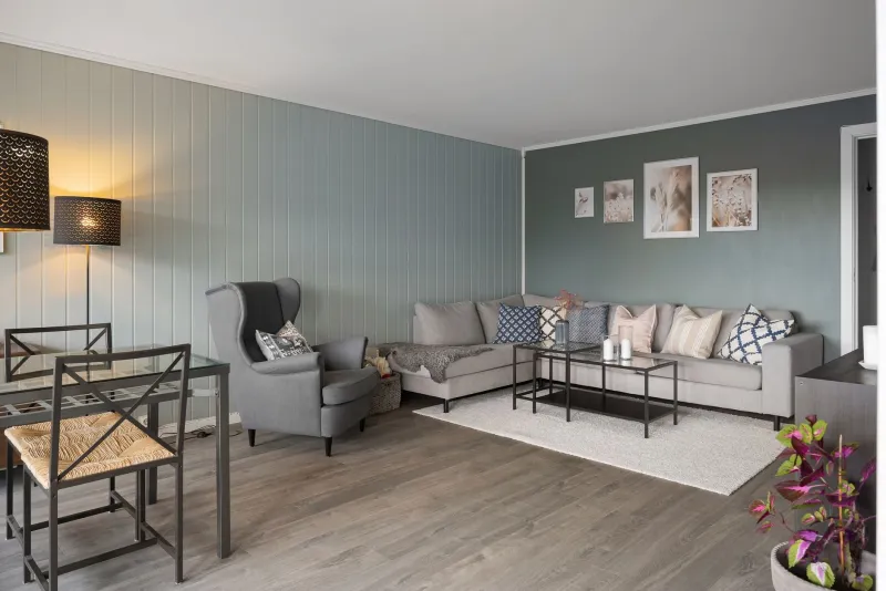
Here's a scenario most of us have lived through. You've spent three weekends painting the living room, chosen the perfect shade, done two careful coats, and stood back feeling pretty pleased with yourself. Then someone visits and says, "Oh, nice — did you just leave the skirting boards white?" And suddenly you can't stop noticing them either.
Skirting boards are one of those design elements that fly completely under the radar — right up until they don't. Get them right and they quietly pull a room together. Get them wrong and they can make even a beautifully decorated space feel unfinished, dated, or oddly disjointed. So let's talk about what you can actually do with your trim, and how to make a decision you won't regret six months down the line.
Why Skirting Boards Matter More Than You Think
At their most practical, skirting boards protect the base of your walls from scuffs, hoovers, and general household battering — which is especially relevant in Ulster homes where damp can creep up from older floors if there's any gap left unprotected. But aesthetically, they act as a visual boundary between wall and floor, and that boundary does a lot of heavy lifting in terms of how a room feels proportionally.
Too stark a contrast between wall and skirting, and the room can feel choppy. Too little contrast and everything blurs into one another. The sweet spot depends on your room's size, ceiling height, light levels, and the overall look you're going for. None of which is a reason to panic — it's just worth thinking about before you reach for the Brilliant White.
The Classic White Skirting: Still Worth It?
Let's be honest — white or off-white skirting boards are the default across most of Northern Ireland, and there's a reason for that. They're clean, they're versatile, and they work with almost any wall colour. If your walls are a mid-tone grey or a warm terracotta, crisp white trim creates a defined edge that sharpens the whole room.
The issue arises when white trim is used without any real thought. Brilliant White on skirting boards can look harsh and clinical against softer, more muted wall tones — the kind of warm, earthy shades that have become popular over the last couple of years. In those cases, swapping to a softer shade like Pointing, String, or a warm cream can make a noticeable difference without straying far from convention.
Also worth considering: white skirting boards show every scuff, every boot mark, and every dog nose smear. In a busy family home, you'll be touching them up constantly unless you use a decent satinwood or gloss finish with a solid sheen level.
Matching Trim to Walls: The Modern Minimalist Approach
One of the bigger shifts in interior design over the past few years has been the move towards painting skirting boards the same colour as the walls — or very close to it. The effect is striking. Rooms feel taller, calmer, and more deliberately designed. It's particularly effective in smaller rooms or spaces with low ceilings, where you want the eye to travel smoothly rather than stop at a contrasting border.
This approach works brilliantly with deeper shades. Imagine a bedroom painted in a soft sage green from floor to ceiling — skirting, walls, and even the architrave all in the same tone. It feels considered and contemporary without being fussy. Plenty of Ulster homeowners have embraced this look in recent years, and it photographs beautifully too, which matters if you're thinking about resale.
The one caveat: you need to be confident in your colour choice before committing. When everything's the same shade, there's nowhere to hide if the colour isn't quite working.
Going Bold: Contrasting Trim as a Design Statement
At the other end of the spectrum, some homeowners are leaning into contrast in a big way — painting skirting boards in a noticeably different colour to create a deliberate, graphic effect. Dark navy skirting against a pale wall. Deep forest green trim in a white room. Charcoal boards running along a warm stone-coloured wall.
Done well, this looks genuinely striking. It anchors the room, draws the eye downward, and adds a sense of architectural detail that older Ulster homes — with their generous skirting heights — are perfectly suited to. Victorian and Edwardian terraces across Belfast, Derry, and beyond often have tall, ornate skirting boards that practically beg to be highlighted rather than painted into invisibility.
The risk is that it can feel heavy if the room doesn't have enough natural light, or if the floor colour is already dark. Test your contrast colour in situ before you go all in — stick a painted sample card at skirting level and live with it for a few days.
What About No Paint at All?
Wooden skirting boards left in a natural or lightly oiled finish are having a quiet moment, particularly in Scandi-influenced interiors and homes with engineered wood or parquet flooring. The idea is to blur the line between floor and wall rather than define it — letting the wood flow continuously rather than being interrupted by a painted trim.
This works best in rooms with a lot of natural light and a relatively neutral palette. In darker or more traditional Ulster interiors, unpainted wood can sometimes look unfinished rather than intentional. It's also worth noting that natural wood skirting requires its own maintenance — oils and waxes rather than a quick touch-up with a tin of satinwood.
The Practical Stuff: Finish, Durability, and Resale
Whatever colour direction you choose, finish matters enormously for skirting boards. Satinwood is the most popular choice for a reason — it's durable, wipeable, and has just enough sheen to look purposeful without being garish. Gloss is more traditional and gives a sharper, harder-wearing surface, though it tends to highlight any imperfections in the woodwork. Matt finish on skirting is increasingly fashionable for that seamless, tonal look, but it marks more easily and is harder to clean.
From a resale perspective, neutral or white skirting remains the safest bet if you're planning to put the house on the market in the next year or two. Bold contrasting trim is a talking point, but it's also a personal preference — and some buyers will see it as more work rather than a feature. If you've gone for something more adventurous, consider whether it's a look that'll photograph well for listings and appeal broadly, or whether it's purely for your own enjoyment (which is, of course, entirely valid).
Making the Call
There's no single right answer to the great trim debate — which is actually the good news. Whether you go tonal, contrasting, classic white, or somewhere in between, the key is making an active decision rather than defaulting to whatever's in the shed.
Spend a bit of time looking at your skirting boards properly — their height, their condition, how they sit against your floors and walls. Then consider what you want the room to feel like. Calm and seamless? Go tonal. Sharp and defined? Try a warm white or off-white. Dramatic and characterful? Lean into the contrast.
Your skirting boards have been quietly doing their job for years. Maybe it's time to give them a bit of credit — and a decent coat of paint to go with it.