What Your Kitchen Colour Is Doing to Your Appetite (And Whether That's a Good Thing)
Your Kitchen Is Playing Mind Games With You
Most of us pick a kitchen colour based on what looks good in a paint swatch or matches the units we've already committed to. Fair enough. But researchers who study colour psychology have spent decades documenting something that might make you reconsider that choice: the colour of your kitchen walls is actively shaping your appetite, your cravings, and your mood while you cook and eat.
This isn't soft, vague lifestyle content. There's genuine behavioural science behind it — and for Ulster homeowners who spend a meaningful chunk of their lives in the kitchen (it's where we all end up at parties, let's be honest), it's worth understanding.
Why Red Kitchens Make You Hungry (And Why That's a Double-Edged Sword)
Red is the most discussed colour in appetite research, and for good reason. It genuinely stimulates. Studies consistently show that exposure to red increases heart rate slightly, raises energy levels, and triggers a sense of urgency — which is exactly why fast food chains have used it for decades.
In a kitchen context, a warm red or deep terracotta on the walls will likely make you feel hungry faster and eat more enthusiastically. For families who need to get reluctant children to the table or who want mealtimes to feel lively and sociable, this can be a real positive.
The flip side? If you're trying to eat more mindfully, or if your kitchen doubles as a workspace during the day, a stimulating red might make it harder to feel calm. It's energising, not relaxing. Bold reds also have a tendency to date — the deep cranberry kitchens of the early 2000s are a cautionary tale. If you love the warmth of red, consider earthy terracottas or burnt clays, which carry the same appetite-stimulating warmth with considerably more longevity.
Orange and Yellow: Cheerful, But Know What You're Getting Into
Orange sits in similar territory to red — warm, stimulating, appetite-enhancing. It also tends to feel sociable and uplifting, which makes it a reasonable choice for open-plan kitchen-diners where you want energy in the room.
Yellow is often cited as a mood-lifter, and in a country where grey skies are the norm for a good portion of the year, that's not nothing. A warm yellow kitchen can genuinely make a dull November morning feel more bearable. However, yellow is one of the trickier colours to live with at scale — it can feel overwhelming or even anxiety-inducing in large doses, and it's notoriously susceptible to looking dingy under artificial evening light.
If you're drawn to yellow, consider using it as an accent — perhaps on a single wall or in a patterned wallpaper panel — rather than committing to all four walls.
Blue and Green: The Calm Side of the Kitchen
Blue is broadly appetite-suppressing in psychological research — it's a rare colour in natural food, which may be why our brains don't associate it with eating. A cool, pale blue kitchen will feel calm, clean, and airy, but don't expect it to make you ravenous.
For homeowners who want a kitchen that feels serene rather than stimulating — perhaps a quieter household, or someone who works from home and uses the kitchen as a thinking space during the day — blue can be genuinely lovely. Navy and deep teal have had an enormous moment in UK kitchens over the last several years, and they're holding up well because they feel considered rather than trendy.
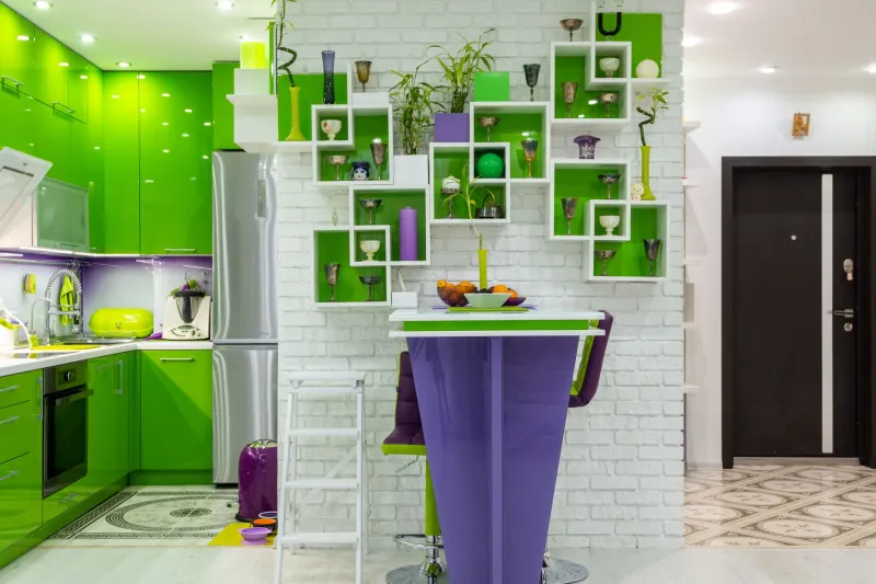
Green is interesting because it sits between the warmth of yellow and the cool of blue, and it carries strong associations with freshness, nature, and health. Sage green in particular has dominated Ulster kitchen renovations in recent years — and there's a reason it keeps selling. It's calming without being cold, it works beautifully with natural wood and stone, and it subtly reinforces associations with fresh, wholesome food. For families who are conscious about what they eat, a green kitchen might genuinely nudge behaviour in the right direction.
White and Neutral Kitchens: The Psychology of the Blank Canvas
The perennially popular white or off-white kitchen is psychologically interesting because it's essentially neutral — it doesn't push appetite in any particular direction. What it does do is create a sense of cleanliness and space, which many people find calming.
The risk with a purely white kitchen isn't psychological — it's practical. In a working kitchen in a real household (particularly one with children, pets, or anyone who cooks seriously), white walls require considerably more maintenance to keep looking their best. If white is your preference, a quality washable finish is non-negotiable — more on that in a moment.
Warm neutrals — linen, stone, warm greige — offer a middle ground that's neither stimulating nor suppressing. They're easy to live with, they don't date quickly, and they work with almost any unit colour. They're also increasingly popular in Ulster homes because they feel genuinely warm in low-light conditions.
The Practical Question: What Works for Your Household?
Once you've thought about the psychological dimension, the practical questions take over. A few worth asking:
Do you want mealtimes to feel lively or relaxed? Warm colours (reds, oranges, warm yellows) create energy. Cool colours (blues, greens, soft greys) create calm. Neither is wrong — it depends on your household.
How much natural light does your kitchen get? Northern Ireland's light is famously cool and diffuse. Warm colours compensate for this beautifully; cool colours can feel chilly in a north-facing kitchen that never sees direct sun.
How long do you want the colour to last? If you're redecorating every five to seven years, a more directional choice is fine. If you're doing this once and not revisiting it for a decade, lean towards colours that have proven staying power — sage, navy, warm white, and soft terracotta have all demonstrated longevity in UK interiors.
What finish do you need? In a kitchen, the sheen level matters enormously. A flat matt might look beautiful but will absorb grease and steam. Eggshell or satin gives you a wipeable surface without the clinical look of a full gloss. For walls near the hob or sink, always go for something you can clean.
A Word on Wallpaper in the Kitchen
Wallpaper in kitchens used to feel like a bold or even risky choice, but modern vinyl-coated and washable wallpapers have made it genuinely practical. A patterned wallpaper on one wall — particularly behind open shelving or on a dining area wall — can bring personality and warmth that paint alone struggles to achieve. Pattern itself can influence mood: organic botanical prints feel fresh and natural, geometric patterns feel energetic and contemporary.
The key is choosing a paper rated for kitchen use, with a surface that can handle the occasional splash and the humidity of a cooking environment.
The Bottom Line
Your kitchen colour choice isn't going to transform your eating habits overnight — but it is one of the quiet, background influences on how your household feels and functions every single day. A bit of thought at the planning stage, grounded in both the psychology and the practical realities of your home and family, can make the difference between a kitchen you simply use and one you genuinely love spending time in.