The Walls Are Talking: How Paint Colours Shape the Way You Feel at Home
Your Walls Have More Influence Than You Think
You've probably walked into a room and felt instantly at ease — or, on the flip side, a bit on edge without knowing why. Chances are, the colour on the walls had something to do with it. Colour psychology isn't a new concept, but it's one that's often overlooked when people are standing in the paint aisle trying to decide between two shades of greige.
For homeowners across Ulster, where the weather can be relentlessly grey from October through to April, the colours you live with indoors carry even more weight. When natural light is limited and you're spending more time inside, your walls become a genuine factor in your day-to-day mood. So it's worth giving them a bit of thought beyond just what looks good in a photo.
Let's break it down room by room.
Bedrooms: Calm the Mind, Improve the Sleep
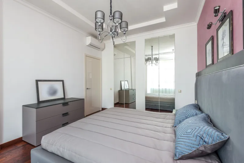
The bedroom is the obvious starting point, because what happens in there — or doesn't happen, if you're lying awake at 2am — directly affects everything else. Research consistently points to cooler, muted tones as the most sleep-friendly palette. We're talking soft blues, dusty lavenders, warm greys, and sage greens.
Blue in particular has been linked to lower heart rates and reduced cortisol levels — the stress hormone that keeps you wired when you should be winding down. A soft, chalky blue like Farrow & Ball's Borrowed Light or a similar pale slate from Dulux works beautifully in Ulster bedrooms, where the light tends to be cool and diffused rather than warm and golden.
Sage green is another brilliant option. It sits in that lovely middle ground between refreshing and restful — earthy enough to feel grounding, but with just enough colour to stop the room feeling clinical. Paired with natural wood tones and linen textures, it's one of the most soothing combinations you can create.
What to avoid: reds and deep oranges close to the bed. They're stimulating colours that signal energy and urgency to the brain — great in other parts of the house, not so great when you're trying to switch off.
Living Rooms: Comfort Without the Coma
The living room has a slightly different brief. You want it to feel welcoming and relaxed, but not so soporific that everyone nods off by eight o'clock. This is where warmer neutrals really earn their keep.
Soft terracotta, warm taupe, and creamy off-whites create that cosy, embracing atmosphere that suits Ulster evenings perfectly. These shades reflect the kind of light you get from lamps and candles rather than fighting against it, which means the room feels genuinely warm rather than just painted to look that way.
If you want something with a bit more personality, consider a deep, muted teal or a moody forest green on one feature wall. These colours have a psychological grounding effect — they connect us to nature, which is particularly beneficial in urban settings like Belfast or Derry where green space isn't always on the doorstep. They add depth and interest without tipping into anxiety-inducing territory.
The key in living rooms is to avoid colours that feel jarring or overly saturated. Bright, highly pigmented shades can create visual noise — fine in small doses, exhausting when you're surrounded by them for hours.
Home Offices: Colour That Works as Hard as You Do
With more people than ever working from home across Northern Ireland, the home office has become a genuinely important space — and one where colour psychology can make a tangible difference to productivity and focus.
Green is consistently rated as the most concentration-friendly colour, and it's not hard to see why. It's easy on the eyes (literally — the human eye requires almost no adjustment to focus on green), and it's associated with balance and steadiness rather than urgency or stress. A medium-toned sage or olive on the walls of a home office can help you stay in that focused, calm-but-alert headspace for longer.
Soft yellows are worth considering too. Yellow stimulates the part of the brain associated with clarity and optimism — a quality that's genuinely useful when you're trying to problem-solve or stay motivated through a long afternoon. The trick is to keep it soft and warm rather than going full sunshine; a butter yellow or pale primrose is energising, where a vivid lemon can quickly tip into overwhelming.
What doesn't work well in a home office: grey. We know, we know — grey has been the default for years. But in a room where you need mental clarity and a bit of drive, grey walls can subtly reinforce feelings of flatness and fatigue. Especially in Ulster's limited winter light, a grey office can feel more like a waiting room than a workspace.
Kitchens: Energy, Appetite, and Social Connection
The kitchen is the social engine of most homes — it's where people congregate, conversations happen, and the day gets started. Colour-wise, you want something that feels lively and welcoming without being frantic.
Warm reds and terracottas have long been associated with appetite stimulation (which is why so many restaurant chains use them), but at home, a full red kitchen can feel a bit intense. A better approach is to use these tones as accents — on an island unit, in tiles, or as part of a two-tone cabinet scheme — while keeping the walls themselves in a warmer neutral.
Yellow and warm cream are classic kitchen colours for good reason. They evoke sunshine, optimism, and a sense of abundance — exactly the kind of energy you want when you're making breakfast or cooking for people you care about. In a north-facing kitchen that doesn't get much direct light, a warm cream or soft ochre can work near-miracles in making the space feel brighter and more inviting.
For those who prefer a cooler, more contemporary kitchen aesthetic, a pale mint or soft duck-egg blue can work well — but pair it with warm wood tones or brass fixtures to stop it feeling cold.
A Note on Northern Irish Light
One thing worth factoring into every colour decision is the quality of light in your specific home. Ulster light is famously soft and cool — it's one of the things that makes the landscape so beautiful, but it does mean that colours can read differently here than they might in sunnier parts of the UK.
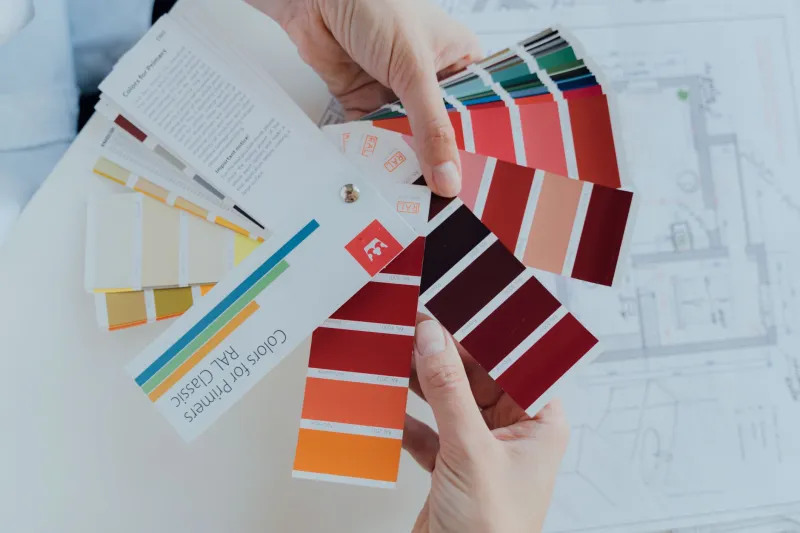
Colours that look warm and inviting on a paint card in a brightly lit showroom can shift noticeably cooler once they're on your walls under Ulster daylight. Always test with a large sample patch and observe it at different times of day before committing. What looks perfect at noon might feel quite different by 4pm on a grey November afternoon.
Putting It All Together
You don't need to redecorate every room at once to start feeling the benefits of more intentional colour choices. Even one room — the bedroom you sleep in every night, or the office where you spend your working hours — can make a meaningful difference to how you feel on a daily basis.
Think of paint less as decoration and more as an environmental setting. You can adjust the temperature, the lighting, the furniture — and you can absolutely adjust the colour. It's one of the most affordable and impactful changes you can make to a space, and when you understand a little of the psychology behind it, it becomes a genuinely powerful tool.
Your walls are already influencing your mood. You might as well make sure they're doing it in the right direction.