Stop Playing It Safe: Bold Paint and Wallpaper Moves That Actually Work in Ulster Homes
There's a particular kind of decorating paralysis that affects a lot of homeowners in Northern Ireland. You've scrolled through enough Pinterest boards and watched enough home renovation shows to know what you want — something with personality, something that feels like a deliberate choice — but when it comes to actually committing to a colour or a pattern, the safe option wins every time.
Another pale grey. Another inoffensive neutral. Another room that looks perfectly fine and absolutely nothing else.
We're not here to shame anyone for their Farrow & Ball Elephant's Breath phase — we've all been there. But if you're genuinely curious about pushing things a little further, there are ways to do it that are considered, reversible where needed, and genuinely transformative. Let's talk about them.
Why Ulster Homes Are Actually Perfect for Bold Decorating
Here's something that doesn't get said enough: traditional Northern Irish housing stock is, in many ways, ideal for bold interior choices. Victorian and Edwardian terraces — which make up a significant chunk of Belfast's residential streets — have high ceilings, original cornicing, and solid plaster walls that take paint beautifully. Period details like dado rails and picture rails give you natural dividing lines to work with. These aren't limitations; they're opportunities.
Modern builds, meanwhile, offer clean lines and open-plan layouts that respond brilliantly to colour blocking and accent features. The challenge in newer homes is often the opposite — creating warmth and character in spaces that can feel a little generic — and that's exactly where bold decorating earns its keep.
The Accent Ceiling: The Move Everyone's Sleeping On
Forget the feature wall for a moment. If you want to do something genuinely unexpected that also happens to be one of the most design-forward moves in contemporary interiors, paint your ceiling.
Not white. Not off-white. Something with actual colour in it.
A deep navy, rich terracotta, or forest green ceiling in a living room or bedroom creates an effect that's almost architectural — it lowers the perceived height of the room in the best possible way, making it feel more intimate and considered. In a bedroom, a moody ceiling colour can feel genuinely cocooning, particularly during those long Ulster winters when you want your home to feel like a refuge.
The trick is to bring the ceiling colour down about 20-30cm onto the walls, blurring the junction and avoiding that slightly awkward look of a coloured ceiling floating above white walls. It sounds counterintuitive, but it grounds the whole thing beautifully.
If full ceiling colour feels like too much of a leap, start with an alcove. Paint the interior of a chimney breast recess or a built-in bookcase in a deep, saturated shade and watch the whole room change character.
Wallpaper Beyond the Feature Wall
The single feature wall had a good run, but interior design has moved on. The more interesting application of wallpaper now is all four walls — or at least three — in a room where you'd least expect it.
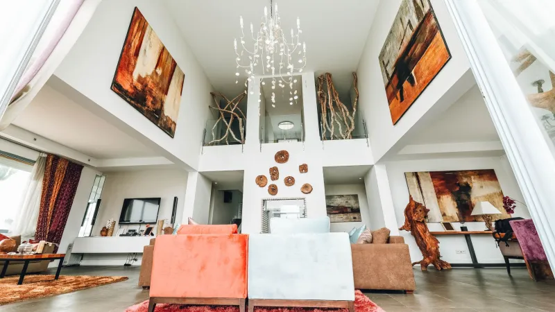
A dining room papered in a bold botanical print. A home office wrapped in a moody, large-scale geometric. A hallway — that often-forgotten transitional space — transformed by a dramatic maximalist pattern that makes the whole house feel like it has a point of view.
In Northern Ireland, where natural light can be limited for much of the year, rich wallpaper patterns in jewel tones — deep teal, plum, inky blue — can actually make a room feel more vibrant rather than darker. The pattern creates visual interest that compensates for what the light doesn't provide.
For traditional Ulster properties, heritage-style prints work particularly well. Think William Morris-inspired botanical repeats, classic toile, or Arts and Crafts geometric motifs that feel at home alongside original fireplaces and wooden floors. For modern builds, abstract watercolour effects and large-scale contemporary patterns create instant personality.
Colour Pairings That Shouldn't Work (But Do)
One of the most liberating things you can do as a homeowner is give yourself permission to break the rules a bit. Some of the most striking interiors come from combinations that look wrong on paper but sing in practice.
Terracotta and dusty pink — warm, earthy, and surprisingly sophisticated. These two tones have enough contrast to be interesting but enough similarity in their underlying warmth to feel cohesive.
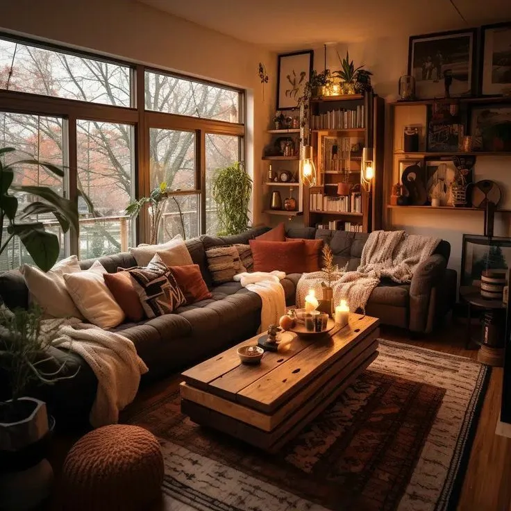
Sage green and deep burgundy — one of those combinations that feels genuinely grown-up. The green grounds it, the burgundy adds richness. Works brilliantly in a living room with natural wood furniture.
Cobalt blue and warm mustard — bold, yes, but consider it as a 70/30 split rather than 50/50. Predominantly blue walls with mustard in soft furnishings and accessories creates impact without tipping into chaos.
The key with unexpected pairings is to commit. Half-heartedness is where it goes wrong. If you're going terracotta and pink, go terracotta and pink — don't water it down with too many neutrals until all the personality has been diluted away.
Texture Layering: Adding Depth Without More Colour
Not every bold statement has to come from colour. Texture is an underused tool in residential decorating, and it's one that works particularly well in Ulster's older housing stock.
Consider combining a textured paint finish — limewash, colour wash, or even a simple dragged effect — with a complementary wallpaper in an adjacent space. The visual contrast between surfaces creates depth and interest that flat paint simply can't achieve on its own.
In hallways or stairwells, a textured finish on the lower half of the wall (below a dado rail) paired with a patterned wallpaper above can feel both traditional and fresh. It's a nod to period decorating conventions while doing something genuinely contemporary with them.
Architectural Details: Painting What You've Already Got
Before you add anything new, look at what you already have. Northern Irish homes — particularly pre-war builds — are full of architectural features that most people simply paint over in the same colour as the walls.
Dado rails, picture rails, cornicing, ceiling roses, skirting boards — all of these can be picked out in contrasting colours to add definition and interest without a single additional element. A room with warm white walls and deep charcoal woodwork feels completely different from the same room with everything painted the same shade. It has edges, definition, intention.
This approach costs almost nothing extra and takes a room from looking like it was decorated in an afternoon to looking like someone actually thought about it.
Where to Begin
If you're new to bold decorating, start with a room you spend less time in — a downstairs loo, a home office, a spare bedroom. The lower stakes make it easier to commit, and you'll quickly find that the result gives you the confidence to push things further elsewhere.
The best interior decisions are rarely the safe ones. Northern Irish homes have the bones to carry something more interesting than another neutral scheme — they just need someone willing to back themselves and pick up the brush.