Beyond Beige: The Colour Trends Reshaping UK Interiors in 2024
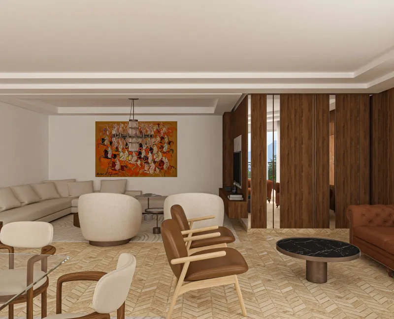
For a good stretch of the last decade, you could walk into almost any home in the UK — from a Victorian terrace in South Belfast to a new build in Surrey — and find the same palette staring back at you. Grey walls. Grey sofas. Maybe a blush pink cushion if someone was feeling adventurous. It was safe, it was inoffensive, and honestly, it got a little boring.
2024 feels different. There's a real appetite for colour that actually means something — shades that create a mood, tell a story, or simply make you feel something when you walk into a room. So what's actually emerging this year, and how does it translate to homes here in Northern Ireland and across the broader UK? Let's have a look.
The Psychology Behind the Shift
Colour trends don't emerge in a vacuum. They're often a reaction to the cultural moment we're living through — and right now, that moment is one of people craving warmth, comfort, and a bit of joy after a few years of collective uncertainty.
Colour psychologists have noted a clear move away from the cool, detached neutrals that dominated the 2010s. Those greys and whites conveyed a kind of aspirational minimalism — clean, uncluttered, Instagram-ready. But they could also feel cold and impersonal, particularly in the context of homes that became offices, schools, and sanctuaries all at once during the pandemic years.
What's replacing them are colours with emotional weight. Earthy tones that feel grounding. Deep jewel hues that feel luxurious. Unexpected warm neutrals that feel lived-in rather than showroom-fresh. The overall effect is interiors that feel more human.
What's Actually Trending in 2024
Warm Terracotta and Clay Tones
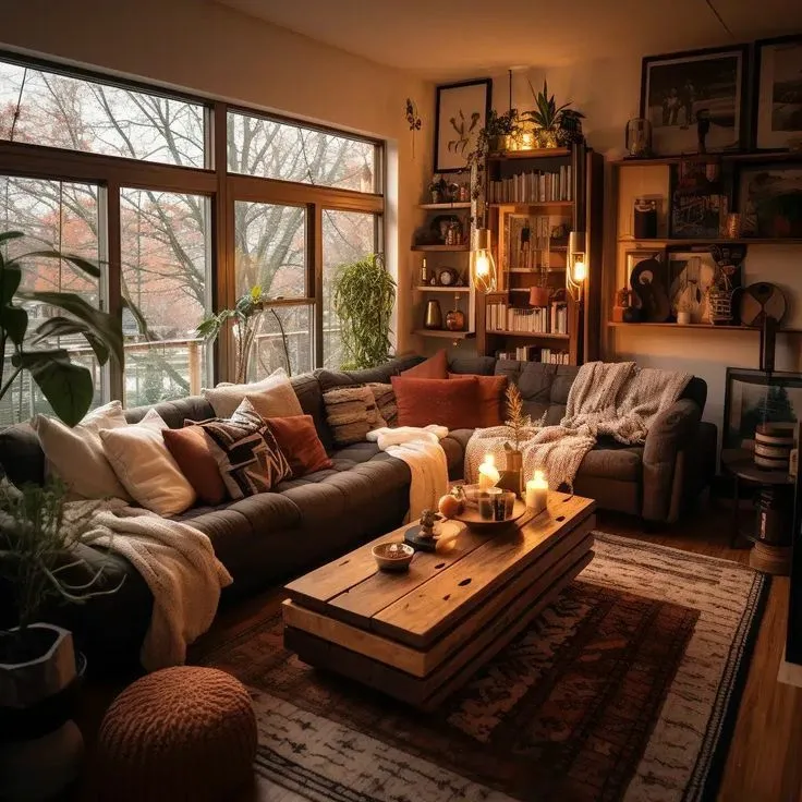
Terracotta has been hovering around the edges of interior trends for a couple of years now, but 2024 is the year it's properly landed. We're seeing it move beyond feature walls and into full room treatments — particularly in living rooms and kitchens — where it creates an incredibly warm, welcoming atmosphere.
For Northern Irish homes, this is a particularly good fit. Our light here tends to be softer and more diffused than in sunnier parts of the UK, and warm terracottas respond beautifully to that kind of light, glowing rather than overpowering. Pair it with natural linen, aged brass hardware, and wooden accents, and you've got something that feels genuinely timeless rather than trend-chasing.
Deep, Moody Greens
Bottle green, forest green, hunter green — whatever you want to call it, this family of deep greens is having a serious moment. It works particularly well in rooms with high ceilings or good natural light, where it creates a cocooning, slightly dramatic effect without feeling oppressive.
In Belfast, we've seen this showing up in a lot of Victorian and Edwardian terraces where the original features — cornicing, picture rails, fireplaces — really come alive against a dark green backdrop. It's also a surprisingly versatile shade; it works with gold, with navy, with blush, and with natural wood tones.
If you're not ready to commit a whole room, a dark green wallpaper in a botanical or textured pattern is a brilliant halfway house. It adds depth and interest without the permanence of paint.
Warm Whites and Off-Whites
This might sound like a contradiction — weren't we moving away from neutrals? Yes and no. The cold, blue-toned whites of the 2010s are definitely on the way out. But warm whites — those with a hint of cream, yellow, or even the faintest blush — are firmly in.
These shades work hard in smaller rooms and north-facing spaces (of which Northern Ireland has plenty, given how our homes are built). They make rooms feel light and airy without that clinical edge that stark white can sometimes bring. They're also incredibly easy to layer with colour and pattern through soft furnishings and accessories.
Unexpected Pinks — But Not Millennial Pink
Millennial pink — that soft, Instagram-famous blush — is firmly in the rearview mirror. But that doesn't mean pink is done. What's emerging instead are more complex, less saccharine versions: dusty rose, terracotta-leaning pinks, deep raspberry, and even antique mauve.
These pinks have a grown-up quality that works in a much wider range of spaces. A deep dusty rose in a bedroom, for instance, feels romantic and sophisticated rather than sugary. A muted antique pink in a dining room pairs beautifully with dark wood and candlelight.
Cobalt Blue and Ocean Hues
Blue has always been popular in UK interiors — there's something about our relationship with the sea and the sky that makes it feel instinctive. But the blues trending in 2024 are bolder and more saturated than the muted navy of recent years. Cobalt, cerulean, and deep Prussian blues are all appearing in interiors that want a statement without going full maximalist.
For coastal communities in Northern Ireland — think Portrush, Ballycastle, or the Causeway Coast area — these shades feel particularly apt. They echo the environment outside and create a strong sense of place inside.
Regional Preferences: Is Northern Ireland Different?
Interestingly, colour preferences do vary across the UK, and Northern Ireland has its own distinct tendencies. Anecdotally — and based on what our customers at Paint & Wallpaper NI are reaching for — there's a strong appetite here for colours that feel warm and sheltering. Given the climate (let's not pretend our summers are anything to write home about), it makes sense that Northern Irish homeowners tend to gravitate toward shades that counteract the greyness outside rather than echo it.
Earthy tones, warm greens, and rich jewel colours consistently outperform cooler, more industrial palettes in local sales. There's also a strong tradition here of using wallpaper in ways that feel expressive and decorative — pattern and texture matter a great deal to Northern Irish homeowners, perhaps more than in other regions.
How to Test Before You Commit
The single most important piece of advice for anyone tempted by the bolder end of the 2024 palette is this: test it properly before you buy a full tin.
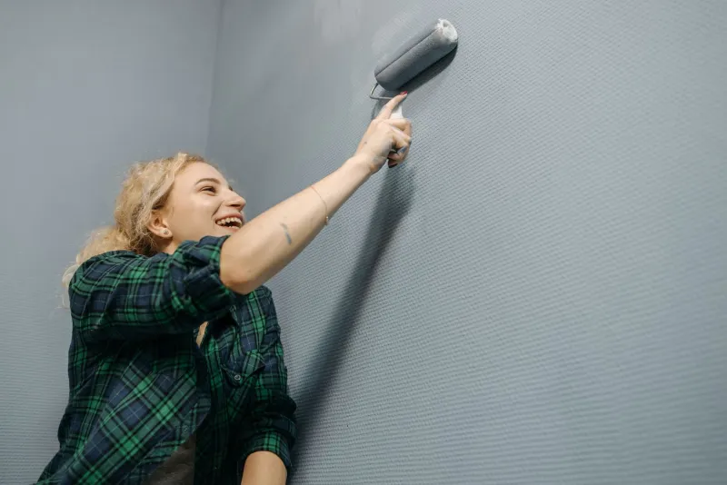
Paint a large swatch — at least A3 size, ideally bigger — directly onto the wall and live with it for a minimum of 48 hours. Look at it in the morning, in the evening under artificial light, on a bright day and on an overcast one. Northern Irish light is notoriously variable, and a colour that looks perfect on a sunny afternoon can feel completely different on a typical grey Tuesday morning.
For wallpaper, order a sample and stick it up with a bit of masking tape. Hold it up against your existing furniture and flooring. Take a photo and compare it on your phone screen — sometimes that slightly different perspective reveals things you missed in person.
If you're genuinely nervous about a bold colour, start with a smaller space — a downstairs loo, a utility room, or a single bedroom wall. These lower-stakes environments let you experience the colour properly before scaling up.
The Bottom Line
2024 is shaping up to be a genuinely exciting year for UK interiors. The era of playing it safe is fading, and in its place is something more considered, more personal, and frankly more interesting. Whether you're drawn to a moody bottle green or a sun-warmed terracotta, there's a shade out there that'll make your home feel like yours again — not just a backdrop for furniture.
And if you're not sure where to start, pop into us. That's what we're here for.